
A bookkeeping business needs a homepage. Visitors should understand the services, decide whether they fit, and find the enquiry form. On a phone, they also need a contact button that reaches the right place.
That is the starting point for a useful Claude Code web design workflow: define the visitor’s task, choose guidance for the part you need help with, build a small page, and check the result in a browser.
Chase.h.ai’s Instagram carousel of seven web-design tools prompted this guide. We downloaded and reviewed all nine slides, then checked the projects’ own documentation. The shortlist includes design instructions, component libraries, motion recipes, extraction software, and browser tools. Their jobs differ.
The example here uses a fictional bookkeeping business and original local HTML. Our browser exercise checks that teaching example. It is not a comparison of Claude Code’s output or a performance test of the seven projects.
Write the page’s job before choosing skills
Start with one page and one useful action. Before describing colors, write what the visitor needs to learn and do. This gives the coding agent a reason to choose a layout.
For our fictional business, the task is simple: explain monthly bookkeeping, payroll coordination, and records preparation, then take the visitor to an enquiry form. There are no approved prices, testimonials, credentials, or client logos to add.
Copy and adapt this brief before asking for a design:
Build one homepage for a fictional bookkeeping business.
Audience: small business owners seeking recurring support.
Goal: explain the services and help a visitor reach the enquiry form.
Approved services: monthly bookkeeping, payroll coordination,
and records preparation.
Tone: calm, clear, orderly.
Primary action: Discuss your bookkeeping.

Use the project's existing framework and content-editing model.
Show the service and primary action clearly on a narrow screen.
Use descriptive form labels and visible keyboard focus.
Keep the content usable with reduced motion enabled.
Do not invent prices, reviews, credentials, or client logos.
Explain the visual direction before implementing it.
Then give the agent your actual brand materials: logo files, approved copy, image rights, and an existing style guide. If those inputs are missing, have it ask for them or propose choices for review. Our broader guide to building a custom-looking AI website covers that earlier planning stage.
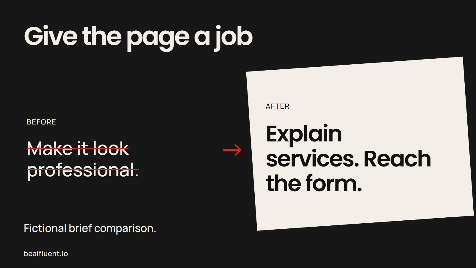
A specific visitor task gives the coding agent a reason to choose a layout.
Match each tool to a specific job
The carousel gives you useful names to investigate. However, installing every entry at once makes it harder to tell which one improved the page. Use this map to choose what your project needs now.
| Job | Project | Useful role |
|---|---|---|
| Carry an existing visual system into a project | designlang / design-extract | Extract design references from a rendered site you own or have permission to use |
| Develop a visual direction | Taste Skill | Guide art direction, image sourcing, and a browser-review loop |
| Critique and refine a page | Impeccable | Apply named design commands and inspect common interface issues |
| Add a particular React effect | React Bits | Supply editable component source for a React project |
| Implement custom animation | GSAP Skills | Guide GSAP timelines, plugins, and animation patterns |
| Add a defined interface transition | transitions.dev | Supply motion recipes and CSS-oriented guidance |
| Exercise the rendered website | Playwright CLI | Let the agent inspect, click, type, and capture browser evidence |
Although these roles come from current project documentation, they do not establish which project will produce the best design for your brief. Star counts and catalog sizes also tell you little about whether a component fits your customer’s task.
For the bookkeeping example, start with one source of design guidance and a browser check. Add animation or a component library when the page has a clear reason to use it. This is our workflow recommendation, not a ranking from the carousel.
Set up one source of design guidance
Use a local project copy or a branch before installing anything. You need Claude Code access, a project you can run locally, and the requirements listed by your chosen tool. Also read its current instructions and the files it adds, including any scripts or hooks.
Claude Code’s skills documentation explains how instructions in a SKILL.md file become available to the agent. A skill can guide a procedure; it still depends on the project’s code, available tools, and the information you supply.
For example, Impeccable documents this setup from the project root:
npx impeccable install
Then, in the coding-agent session, its current workflow starts with:
/impeccable init
Follow the upstream installation instructions for your coding tool. We verified those instructions but did not run this installer for our teaching example.
Taste Skill is another direction to evaluate. Its repository describes art direction, real-image sourcing, and rendered browser checks. Check its runtime requirements before choosing it, since its workflow uses a browser and network access for imagery.
Start with one of these guidance systems. After the first build, judge whether another tool fills an identifiable gap. If two sets of rules disagree about your brand, settle the design decision before generating more code.
Build one page, then ask for a focused critique
Ask Claude Code to implement the approved brief in the existing project. Before expanding to other pages, open that first result at desktop and phone widths. Check whether the service and next action remain clear.
For our bookkeeping example, a useful critique might find that the service descriptions compete with the enquiry action. Another might find that the headline wraps badly at 390 pixels. Name the problem before changing the page. Before accepting a finding, ask which element it concerns and what change would fix it.
Impeccable documents commands such as critique, audit, and polish. You can request a targeted review through its documented command workflow, then decide which findings matter for this page. A preference for another visual style is not automatically a usability defect.
Use a prompt like this to keep the revision bounded:
Review this homepage against the approved brief.
Check whether the service, audience, and primary action are clear.
Inspect desktop and narrow-screen layouts.
Identify concrete problems with hierarchy, spacing, contrast,
keyboard access, form labels, and the enquiry route.
For each finding, name the element, the problem, and a specific fix.
Keep optional style preferences separate.
Fix the agreed issues, then repeat the affected browser checks.
If the site uses a CMS, inspect how the owner will edit it too. A component that works in a React app still needs an integration plan for a WordPress site whose owner expects editable blocks. Preserve that editing experience in the brief.
Separate concrete defects from optional style preferences.
Add motion when it explains an interaction
Once the page works, consider whether motion helps a visitor follow a change. A short transition after opening a section may be useful. A moving background behind the service description may compete with the words.
The tools offer different paths. React Bits supplies React components, while GSAP’s official skills guide animation code. transitions.dev packages particular transition recipes. Choose the smallest addition that serves the interaction.
Before adopting a component, inspect its dependencies, keyboard behavior, and behavior when the visitor prefers reduced motion. Also check the license. React Bits’ source uses MIT with the Commons Clause; transitions.dev separates its library terms from its tooling and paid features. Available on GitHub does not tell you the full reuse terms.
For this fictional homepage, we keep the main content static. The service explanation and enquiry form already do their jobs. If you later add an effect, compare the page with and without it at the same viewport and repeat the interaction checks.
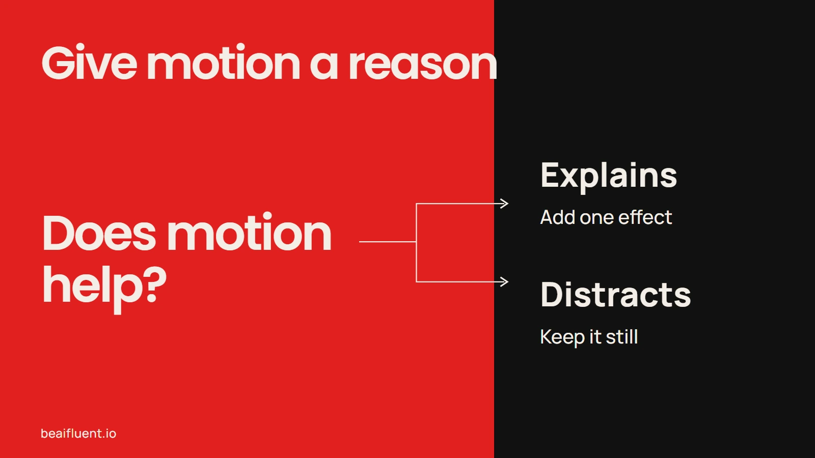
Add a transition when it helps the visitor follow a change.
Ask the browser to check what a screenshot cannot
Run the page through a real browser before treating it as ready. A screenshot can show a clipped headline, but you need an interaction check to find a button that points nowhere or a form that cannot accept input.
For example, Microsoft’s Playwright CLI gives coding agents browser-control commands and optional skill guidance. Its official setup guide describes the runtime and browser requirements. Installing design guidance alone does not establish that a browser controller is present or that the agent used it.
You can give the agent this acceptance task after the page builds:
Open the local homepage in a real browser at 390 and 1440 pixels.
At each width, check for page-level horizontal overflow.
Click the primary action and confirm it reaches the enquiry form.
Tab through the page and inspect visible focus.
Try the empty form, then valid fictional input.
Report what validation and confirmation actually do.
Repeat with reduced motion enabled.
Capture screenshots and report checks you could not complete.
Do not submit a real customer enquiry or publish the site.
Also ask someone unfamiliar with the page what the business does and where they would go next. Browser checks establish specific behavior. They do not prove that real visitors understand the offer or will make an enquiry.
What our local example actually checked
We created two original static HTML versions of the fictional homepage and exercised them with our existing Python Playwright setup. We did not generate these pages through Claude Code, run the Playwright CLI package, or install the seven recommended projects.
The first version deliberately contains a fixed-width hero and a primary link with no matching destination. The revised version uses a responsive layout and a working local enquiry route. This lets us check whether the browser exercise can detect known defects as well as accept the corrected page.
| Check | Observed result in the local exercise |
|---|---|
| Narrow-screen layout | The first page measured 924 pixels wide in a 390-pixel viewport. The revised page matched both the 390- and 1440-pixel viewports. |
| Primary action | The first link had no target. The revised link reached #enquiry; its button measured 48 pixels high. |
| Keyboard access | The first Tab stop on the revised page displayed a visible 3-pixel outline. |
| Form behavior | All three required fields blocked empty input. Valid fictional input produced a local confirmation; no external request occurred. |
| Reduced motion | With the preference enabled, the revised page had no active animations or nonzero transitions. |
The form is a local demonstration and sends no enquiry. Its confirmation does not prove email delivery, CRM storage, spam protection, or booking integration. Those need their own checks when you connect a real form.
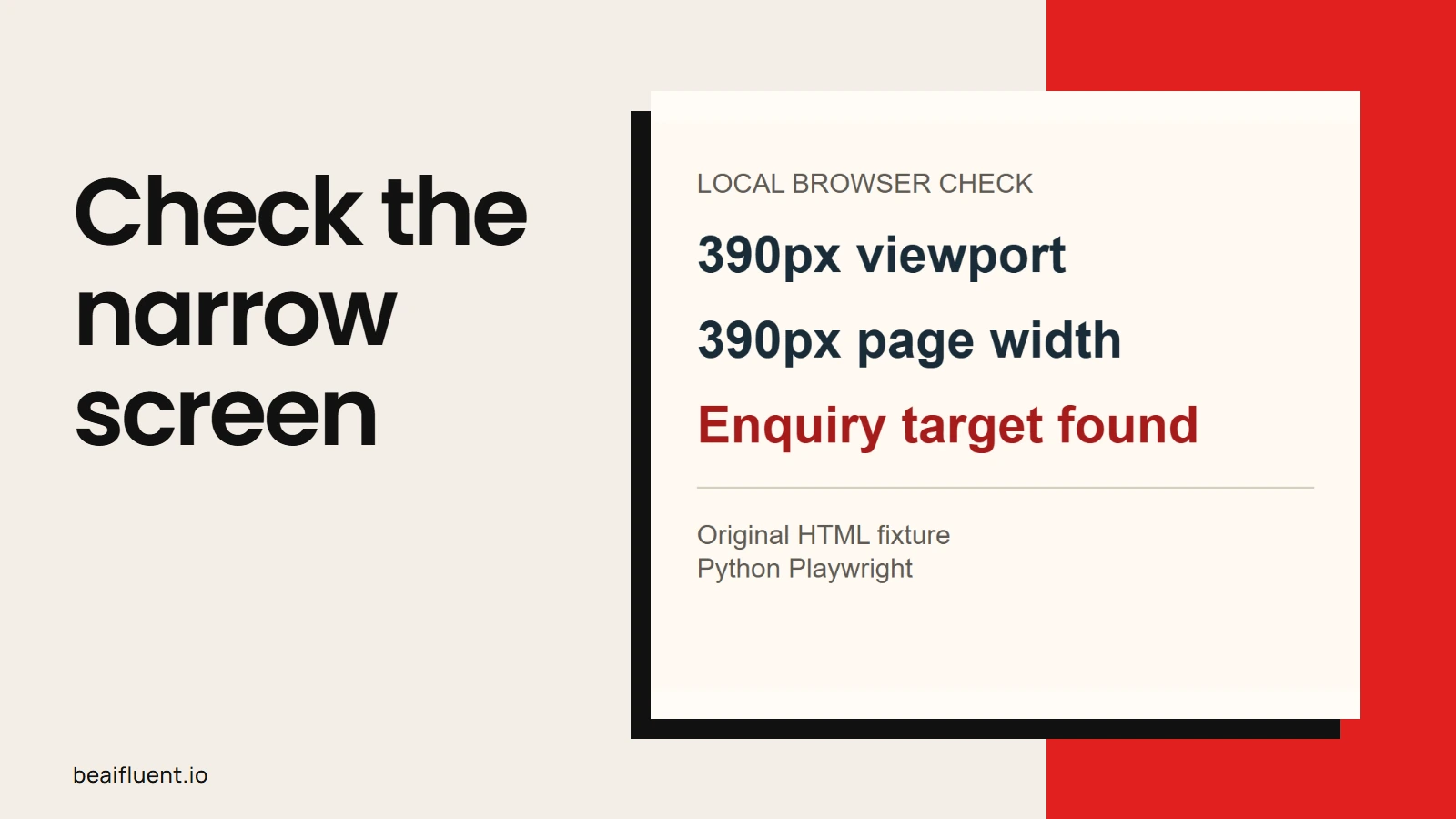
Observed local fixture checks with Python Playwright; no upstream skill benchmark is implied.
Keep the result easy for the owner to maintain
Before handing over the page, record the tools you kept, the files they changed, and the checks you ran. Include the approved copy, image sources, and where the owner can edit each section.
If you used designlang, treat its extracted design artifacts as references to review. A page’s computed styles do not supply the rights to its photographs, copy, or brand identity. For an existing business, start from its own approved materials.
Keep a short handover checklist:
- [ ] The owner approved the service claims and primary action.
- [ ] The chosen guidance fits the brand and existing framework.
- [ ] Added components have a clear job and reviewed reuse terms.
- [ ] The enquiry route, keyboard access, and narrow layout were exercised.
- [ ] The owner can edit the page in the expected way.
- [ ] Any untested connection or unresolved issue is written down.
Our guide to checking AI output covers the wider habit behind this process: inspect the result against evidence and the task. For a business website, the useful endpoint is a page your visitor can use and your owner can maintain.
Sources
Project documentation checked on 22 October 2026. Creator recommendations supplied the research direction; the workflow and fictional example are our own.