

If you want to build websites with AI without getting the usual generic result, the fix is not “use better AI” in the abstract. The fix is to use a better workflow. A strong AI website workflow starts with brand evidence, turns that evidence into visual direction, uses a coding agent or builder to assemble the site, checks the result on mobile, and ships through a normal Git-to-deployment path. That is how AI-assisted websites start to feel custom instead of synthetic.
This article expands a short-form reel breakdown into a complete guide. The reel showed a fast stack built around Firecrawl, a coding-agent environment, image generation, GitHub, and Vercel. I am keeping the useful parts of that sequence, adding the missing detail, and separating the durable method from the reel’s shorthand tool labels. Where I map one of the reel’s steps to a specific product capability, I say so explicitly and treat that mapping as an inference from the on-screen workflow.
Key Takeaways
- AI websites look generic when you skip brand extraction, reuse vague prompts, and trust the first layout the model gives you.
- A better workflow is brand first: capture logos, colors, typography, messaging, and structure before you generate anything new.
- Use image models for controlled hero assets and motion ingredients, not for inventing the entire site identity from scratch.
- Use a coding agent or builder to assemble sections, responsive behavior, and component structure after the brief is clear.
- Review the output like a real production project with responsive QA, Git version control, pull requests, and deployment checks.
- The goal is not to hide AI. The goal is to make the final site feel intentional, on-brand, and commercially credible.
Table of Contents
- Why most AI websites look AI-generated
- The workflow that makes AI-built websites feel custom
- A practical brief for the coding step
- How to quality-check an AI website before it goes live
- Common mistakes that make AI websites feel cheap
- FAQ
Why Most AI Websites Look AI-Generated
Most weak AI websites fail for predictable reasons. The builder starts with a vague request like “make me a modern website,” the model invents a random visual direction, the copy becomes broad and interchangeable, and the layout collapses into common SaaS tropes. The problem is usually not that AI touched the project. The problem is that the workflow left too many important decisions open.
The fastest way to improve results is to stop treating the build as one giant prompt and start treating it like a staged production process.
| Generic AI site pattern | Custom-feeling alternative |
|---|---|
| Starts from a template or broad style adjective | Starts from real brand evidence and site context |
| Uses one-shot prompts for the whole site | Separates brand, visuals, structure, and deployment into distinct stages |
| Uses generic stock-style hero graphics | Creates specific branded imagery and supporting motion |
| Ignores the current site architecture | Reuses proven structure where it still serves conversion |
| Looks acceptable only on desktop | Is checked across mobile and touch contexts |
| Ships from a local export with weak revision control | Ships through Git, pull requests, and deployment previews |
That distinction matters because responsive quality is not optional. Google notes that modern responsive design has to account for different screen sizes and interaction modes such as touch, with the goal of optimizing the experience for everyone (web.dev).
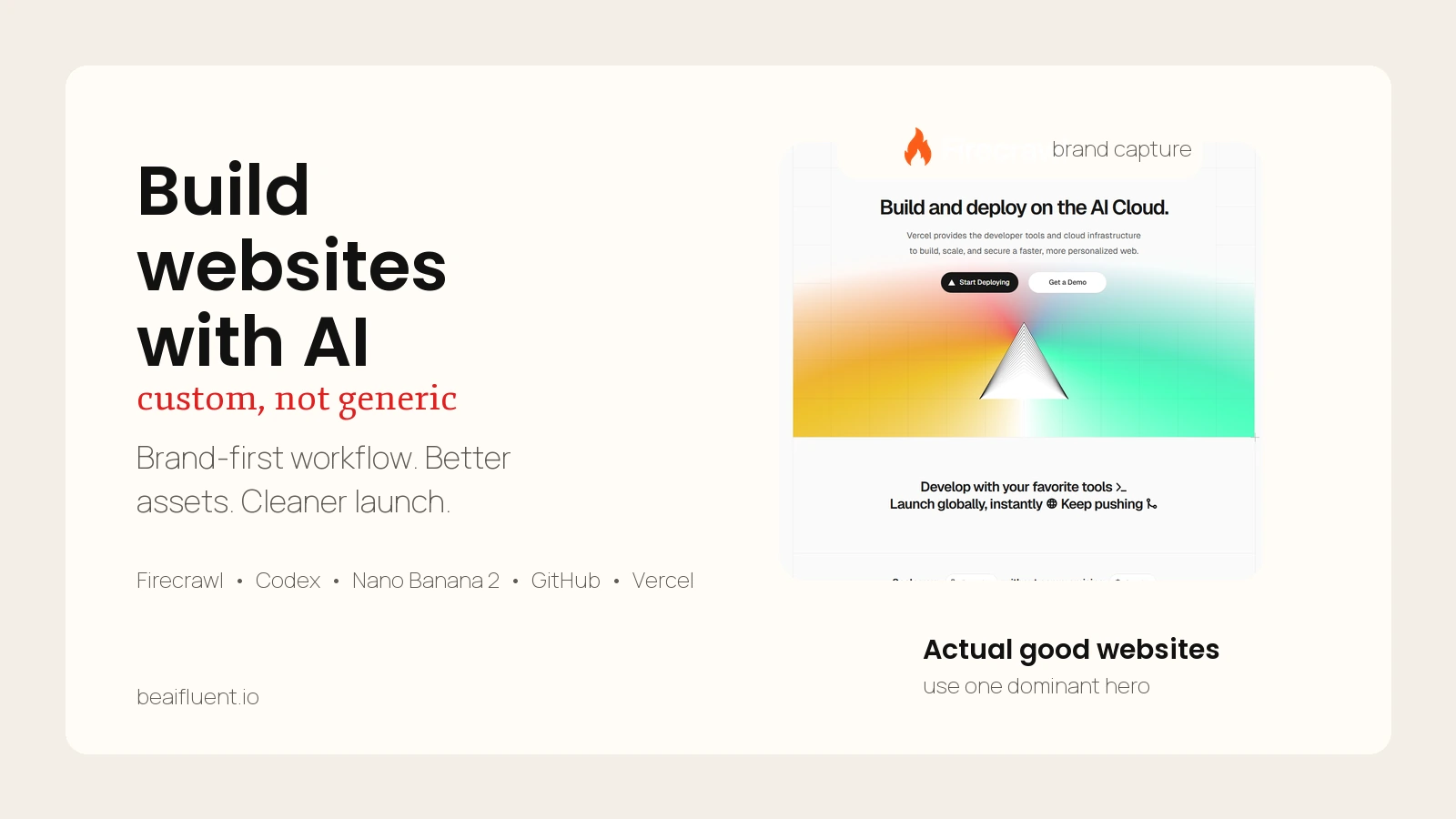
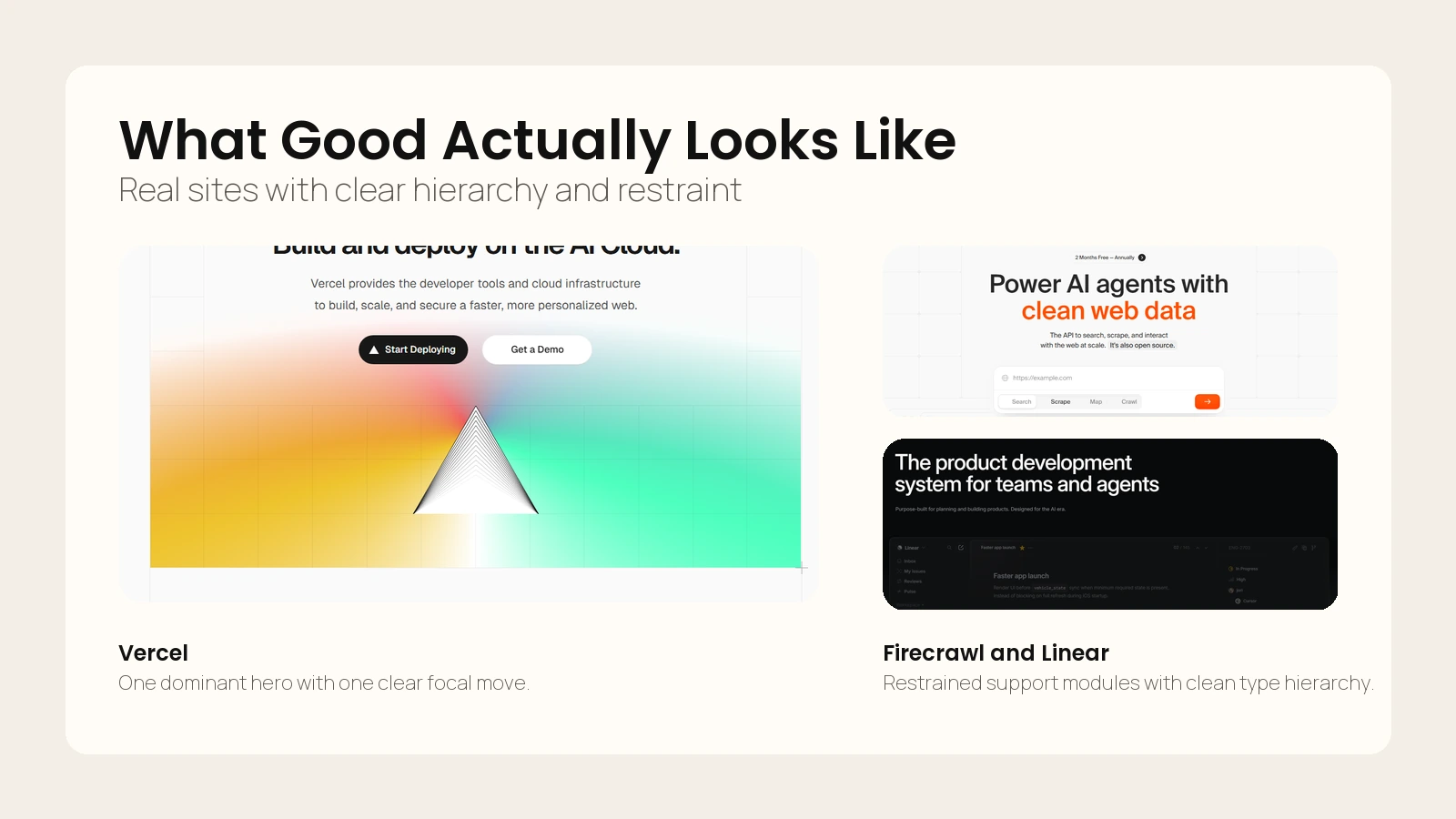 Caption: Strong websites usually rely on one dominant surface, clear type hierarchy, and restrained supporting detail.
If you already think in workflows rather than one-shot prompts, How to Use AI Workflows for Research, Notes, Meetings, and Planning is a useful companion because the same principle applies here: break the job into stages, define review gates, and keep human judgment in the loop.
The main shift is this: do not ask AI to “make the website.” Ask AI to help you produce the inputs, assets, structure, and code that make a website feel like it belongs to a real brand.
The Workflow That Makes AI-Built Websites Feel Custom
The reel used a fast seven-step arc. That is a good starting point, so I am keeping that structure and expanding what each step needs in practice.
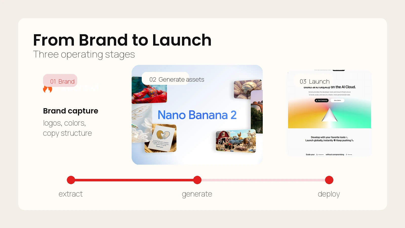 Caption: Custom-looking AI sites come from a staged workflow rather than one large prompt.
1. Extract the brand before you design anything
The first job is not visual generation. It is brand capture.
Firecrawl’s scrape docs describe the tool as turning a URL into clean data, converting web pages into markdown and supporting outputs such as structured data, screenshots, HTML, and branding extraction (Firecrawl). That matters because the first version of your brief should come from the company’s existing evidence:
- logo usage
- typography style
- palette
- visual motifs
- headline patterns
- service framing
- proof blocks
- current section structure
This is where many AI builds go off the rails. If you skip brand extraction, the image model and site builder will improvise a personality. That is why so many AI sites feel polished but wrong.
For a service business, store this step as a concise brand sheet:
- Brand promise
- Primary audience
- Offer hierarchy
- Primary colors and accent colors
- Typography cues
- Existing proof and trust elements
- Current site sections worth preserving
2. Turn the brand sheet into a real build brief
The reel labels this step as “Cloud Code.” Based on the on-screen workflow, the durable lesson is not the label. The lesson is that you need a coding-capable environment that can accept a structured brief, generate assets or integrate them, build sections, and iterate on the output.
OpenAI describes Codex as a cloud-based software engineering agent that can work on many tasks in parallel, with each task processed in a separate environment preloaded with the codebase (OpenAI). That is one example of the kind of environment this step benefits from.
This mapping is an inference from the reel’s visuals, not a confirmed claim about the exact tool used in the video.
What matters operationally is the brief quality. Your coding step should include:
- project goal
- brand constraints
- target page structure
- section order
- conversion goal
- layout direction
- image asset rules
- responsive requirements
- implementation constraints
If you want a stronger foundation for the image side of this workflow, How to Write Better Image Prompts helps because the same asset brief often feeds both the visual generation step and the site build step.
3. Generate hero assets with a narrow purpose
The reel’s visual step uses “Nano Banana 2” to create two images: a clean hero image and an exploded version. Google’s Gemini help docs say Nano Banana 2 supports better text rendering, local edits, enhanced instruction following, and higher output quality, while Nano Banana Pro can regenerate images with extra detail (Google).
That capability is useful, but the bigger lesson is strategic: generate assets with a narrow job.
Good AI website visuals usually do one of these jobs:
- hero image
- product or service illustration
- before-and-after transformation visual
- background support image
- motion ingredient
- diagram or infographic
Bad AI website visuals try to define the entire brand in one shot.
The reel’s “clean hero plus exploded version” pattern is smart because it gives you both a stable main visual and a second asset you can animate, transition, crop, or reuse in secondary sections.
4. Turn static visuals into motion carefully
Short motion can make a site feel more premium, but only if it supports the page rather than shouting over it.
The reel suggests creating a short transition from the two generated images and then bringing that motion back into the site build. That works best when the motion is:
- subtle
- fast to load
- loop-safe
- relevant to the offer
- not required to understand the page
In practice, motion is most useful in hero sections, service intros, or supporting proof bands. It should reinforce the idea that the site was designed, not merely assembled.
5. Build the site around sections, not around a single prompt
This is where the workflow becomes a website instead of a demo.
Your coding agent or builder should now assemble:
- headline and subhead
- hero module
- proof section
- services or feature grid
- process section
- trust or testimonial section
- CTA section
- footer
Do not ask for “a beautiful homepage.” Ask for a sequence of sections with specific jobs.
This step also has to include responsive behavior. Web.dev’s guidance is clear that responsive design should adapt to a wide range of screen sizes and interaction modes (web.dev). That means the build brief should explicitly call for:
- mobile-first spacing adjustments
- readable line lengths
- clear tap targets
- stable stacking rules
- image crops that survive on narrow screens
- fast-loading fallbacks where animation is present
6. Reuse the current site’s structural logic when it still works
One of the most useful moments in the reel is the “current site HTML” step. This is the part most beginners skip.
If the client’s current site already has a sensible information architecture, you do not need to reinvent it just because AI is involved. Preserve what already helps conversion:
- page hierarchy
- core section order
- key proof areas
- useful copy themes
- known trust signals
Then improve what is weak:
- visual polish
- content clarity
- responsiveness
- consistency
- speed
- CTA strength
This is often the difference between a site that feels commercially real and a site that feels like a speculative concept.
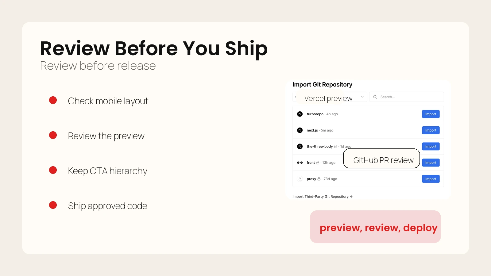
7. Ship through Git and deployment previews, not through chaos
If you want the final result to feel professional, the handoff matters as much as the design.
GitHub describes pull requests as the core collaboration feature for proposing, reviewing, and merging code changes before they reach the main codebase (GitHub). Vercel’s Git deployment docs say Git-based workflows provide preview deployments for every push and production deployments for the most recent changes on the production branch (Vercel).
That gives you a clean shipping pattern:
- Generate or refine the site in a codebase.
- Commit meaningful changes.
- Open a pull request for review.
- Check the preview deployment.
- Fix layout or copy issues.
- Merge to the production branch.
- Let production deploy from the approved branch.
This is the point where an AI-assisted build stops looking like a prototype and starts behaving like a real website project.
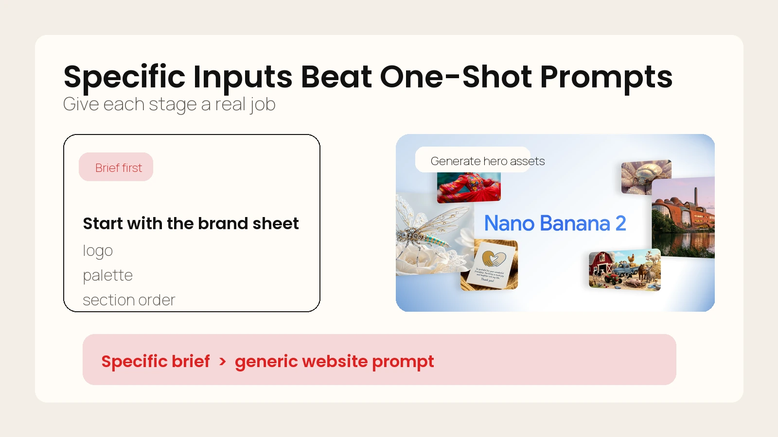 Caption: The reel’s workflow becomes useful when translated into a clearer brief and asset system.
A Practical Brief for the Coding Step
The easiest way to ruin this workflow is to write a vague brief. If you want the coding step to produce something commercially usable, give it a brief that sounds like an actual creative and production direction.
Here is a practical starter template:
Goal:
Build a conversion-focused homepage for [brand] that feels premium, modern, and custom rather than generic AI-generated.

Audience:
[Who the page is for]

Offer:
[Primary service or product]

Conversion goal:
[Book a call / request a quote / start a trial / buy now]

Brand inputs:
- Primary colors:
- Accent colors:
- Typography cues:
- Tone:
- Visual references:
- Existing trust assets:

Structure:
1. Hero
2. Social proof
3. Services or feature blocks
4. Process
5. Testimonial or case study
6. CTA

Visual rules:
- Use the provided hero asset and secondary asset
- Keep the look clean and editorial
- Avoid stock-dashboard styling
- Avoid generic gradient blobs unless tied to the brand

Responsive rules:
- Prioritize mobile readability
- Preserve headline impact on narrow screens
- Keep CTAs visible without crowding
- Ensure all image crops work at mobile widths

Implementation rules:
- Semantic HTML
- Reusable sections/components
- Lightweight animation only where it supports the message
- Clean spacing system
- Accessible contrast and heading structure
That template works because it gives the agent enough context to make decisions without inventing the whole brand.
If your workflow also includes a terminal-based coding agent, What Are AI CLIs? Codex, Claude Code, and Gemini CLI Explained is the right companion read for understanding how the coding layer fits into a broader production stack.
How to Quality-Check an AI Website Before It Goes Live
AI-assisted websites often fail in the final 20 percent. The homepage looks good at first glance, but the spacing breaks on mobile, the CTA feels weak, the copy gets repetitive, and the design starts to feel synthetic when you scroll.
That is why this workflow needs a review gate.
Use this pre-launch checklist
- Does the hero clearly reflect the brand instead of looking like a generic AI poster?
- Does each section have a distinct job, or do multiple sections repeat the same promise?
- Does the page keep its hierarchy on mobile?
- Do the images still make sense when cropped vertically?
- Are the CTAs concrete and specific?
- Does the site preserve the best structural logic from the current site?
- Is the motion subtle enough not to hurt clarity or speed?
- Can another person review the code and preview through Git before release?
Evaluate the site on three layers
| Layer | What to review | Failure mode |
|---|---|---|
| Brand fit | Colors, tone, visuals, trust signals | Looks polished but not like the company |
| UX quality | Hierarchy, spacing, responsiveness, CTA clarity | Looks fine in one viewport but breaks in real use |
| Production quality | Version control, PR review, preview deployment, rollback path | Hard to edit, review, or safely ship |
If you need a reality check on whether the output is trustworthy enough to use, Are AI Tools Accurate? How to Set Realistic Expectations is useful because the same principle applies here: the model output can be impressive and still need verification.
A custom-looking AI website is not the one with the fanciest prompt. It is the one that survives review.
Common Mistakes That Make AI Websites Feel Cheap
The most common mistakes are not technical. They are workflow mistakes.
Mistake 1: letting the model invent the brand
If you do not feed real brand evidence into the process, the final site will borrow visual cliches from the model’s training patterns. That is why so many AI sites look like they belong to nobody in particular.
Mistake 2: prompting for a whole website in one shot
One giant prompt sounds efficient, but it usually creates vague layout logic and repetitive copy. Break the project into brand capture, asset generation, build, and review.
Mistake 3: overusing AI visuals
Not every section needs a generated illustration. Sometimes the premium move is to use one strong hero surface and keep the rest of the page restrained.
Mistake 4: skipping mobile review
Desktop-first demos hide weak stacking, oversized headlines, and broken crops. A site that only works in the builder preview is not production-ready.
Mistake 5: shipping outside a normal dev workflow
If the build never touches version control, previews, or review, it is much harder to fix safely. Production discipline is part of what makes the result feel premium.
Mistake 6: using vague CTAs
The site can look excellent and still underperform if the CTA says almost nothing. Keep the CTA aligned to the actual conversion event and make the next action obvious.
 Caption: Production discipline is part of what makes the result feel custom and trustworthy.
FAQ
Can AI really build websites that feel custom?
Yes, but usually not from a single broad prompt. AI gets much closer when you separate brand extraction, asset generation, section assembly, responsive QA, and deployment into distinct stages with human review.
Do I need a coding agent, or can I use a visual builder?
You can use either. The important requirement is that the build environment can accept a structured brief, iterate on layout and sections, and let you review the result cleanly before publishing.
Why do AI websites often look generic even when the visuals look polished?
Because polish is not the same as brand fit. Many weak AI sites have decent colors and graphics, but the structure, messaging, and hierarchy could belong to almost any company.
Should I keep parts of the current site instead of replacing everything?
Usually, yes. If the current site already has a useful section order, trust elements, or conversion logic, keeping that structural backbone often produces a stronger final result than starting from zero.
Conclusion
If you want to build websites with AI that do not scream “AI-generated,” focus less on finding a magical model and more on building a disciplined workflow. Extract the brand first. Generate visuals with a narrow purpose. Build around sections, not vibes. Reuse structural logic that already works. Then ship through a normal Git and deployment path.
That is the durable lesson behind the reel. The tools may change, but the method is stable: evidence first, assets second, build third, review fourth, production handoff last.